Website Redesign
Seattle Audubon
B A C K G R O U N D
Seattle Audubon is an organization leading the community of Seattle in appreciating, understanding, and protecting birds and their natural habitats. The Seattle Audubon website is meant for people who want to get to know their surroundings better and become involved in the outdoors. It is a tool to learn more about nature, conservation, science, and advocacy that goes behind protecting the native bird species in Washington.
A P P R O A C H
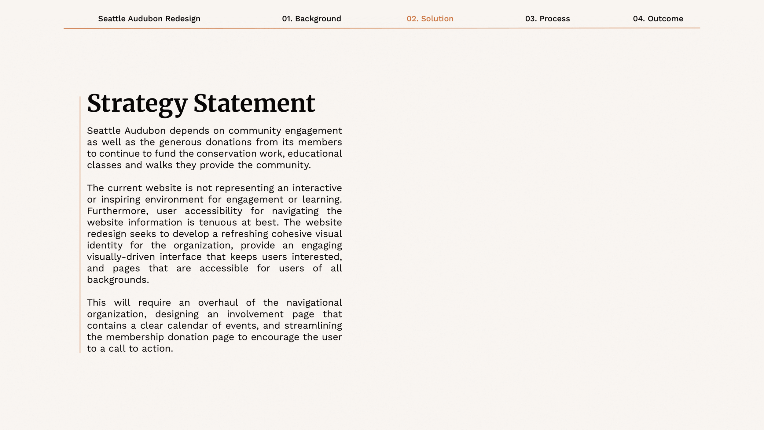
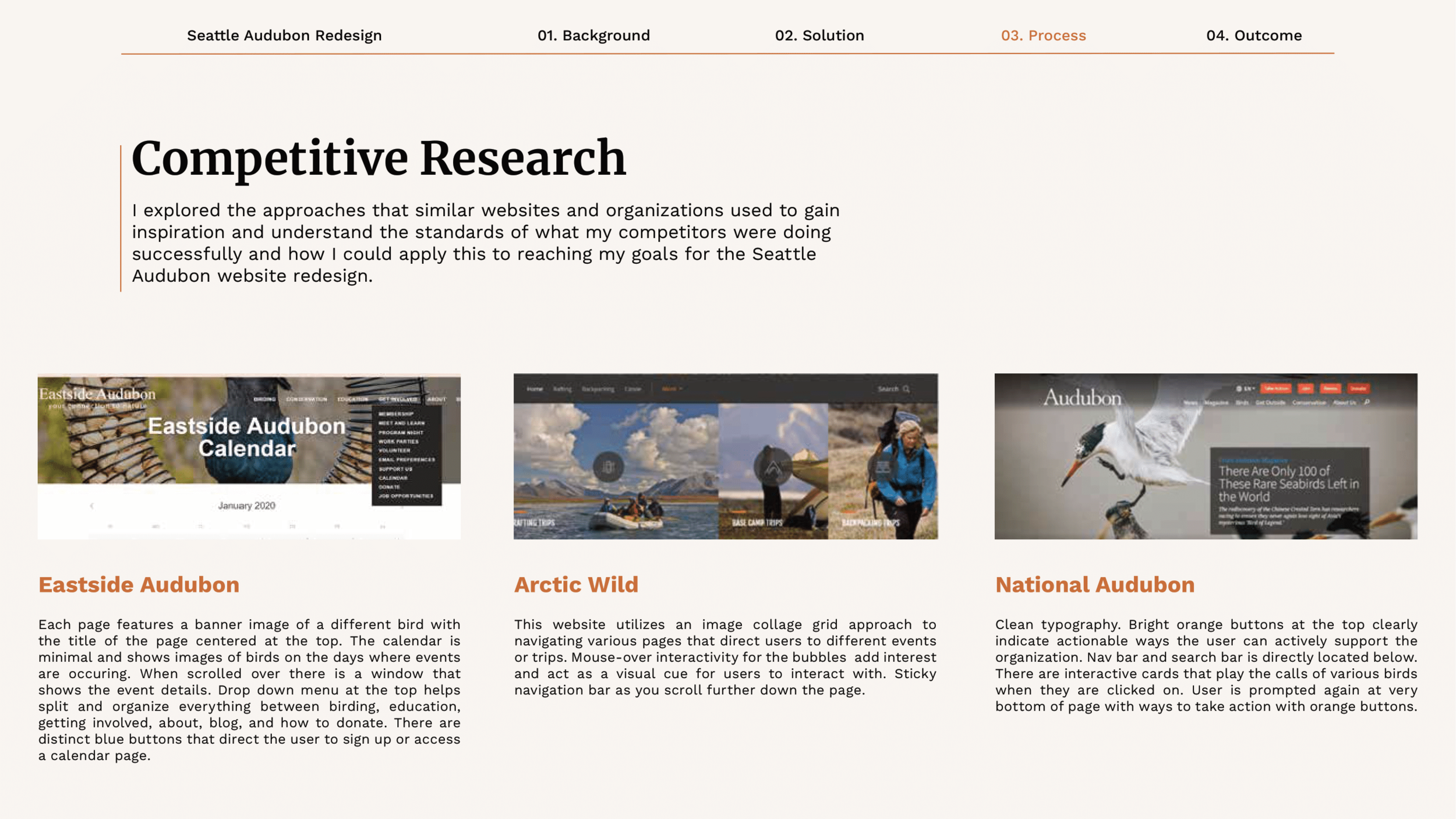
The current Seattle Audubon website lacks a visual consistency to its various web-pages, has confusing navigational bars to the left and top of the pages, and a lack of visual engagement or interactivity. Furthermore, the heavy amount of text and lack of content organization on each page makes finding information difficult and stressful. This is my redesign.
Scroll down to view the case study and final product ↓
My redesign seeks to develop a cohesive visual identity for the website
This required redesigning the logo, streamlining the navigational organization, creating an involvement page that contains a clear calendar of events, and creating a donation page that matches the rest of the website for both desktop and mobile.
Feel free to scroll down to the bottom to view the entire case study documenting my process and research.

Mobile Homepage Redesign

Desktop Mobile redesign

Desktop Membership Page Redesign

Mobile Membership Page Redesign

Mobile Field Trips Page Redesign

Desktop Field Trips Page Redesign


